SMX Liveblog: Getting Mobile Friendly to Survive the Next Mobilegeddon was originally published on BruceClay.com, home of expert search engine optimization tips.
Mobile. Mobile. Mobile!
Moderator:Barry Schwartz, News Editor, Search Engine Land, RustyBrick (@rustybrick)
Speakers:
- Gary Illyes, Webmaster Trends Analyst, Google (@methode)
- Stoney deGeyter, CEO, Pole Position Marketing (@StoneyD)
- Marcus Tober, Founder/CTO, Searchmetrics Inc. (@marcustober)
Gary Illyes: Google’s Mobile Focus
When Gary was a kid he never did what parents and teachers told him to do. Roughly when Justin Beiber was knee-high to a snow blower, his parents got him a computer and thought that might give him something to spend time on in a good way. It didn’t work. But around 2000 he got a cell phone. This made him very cool. That worked!
In 2005 he got his first girlfriend a mobile phone. He expected she’d be excited about it. Her response: Is there Internet on it?
Gary appreciated the power of the Internet for getting him Super Mario cheat codes. But he also saw there was more than 10 blue links. He’s flashing photos of cats playing keyboards on the screen.
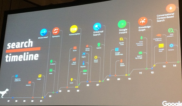
People’s expectations of search have changed and continue to change – radically.
Autocomplete was a change, for example. Today Google focuses exclusively on mobile. 2015 is the year when mobile search exceeds desktop searches.
People aren’t just searching. They’re shopping, reading email, seeking advice, comparing products and reviews.
- Mobile friendly update: On April 21, 2015, Google made the mobile-friendly update. They look at “5 or so” properties of a page and if they appear right on a mobile screen.
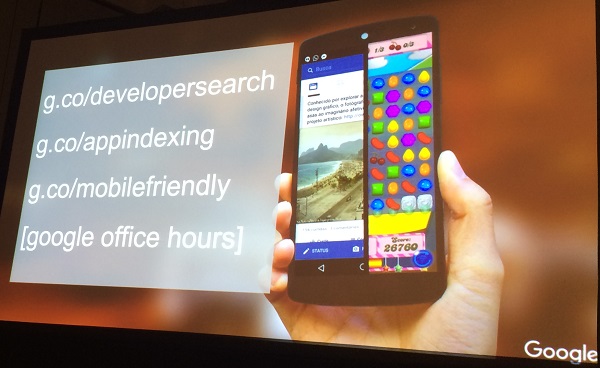
- App indexing: Apps show up in search results and when users click on the result and have the app installed, they’ll bring the user to that result in the app. If they don’t have the app, there’s an install button in the result. This takes away friction.
- Google Now: It effectively pushes relevant info to you. Traffic alerts, photospots, see this presentation by Cindy Krum from Day 1 of SMX East (link).
- Now on Tap: At Google I/O, Google talked about it. If you’re chatting with a friend and want to organize dinner, you shouldn’t have to copy and paste text into a search box. Instead, a long tap on the chat text will give you more info and context.
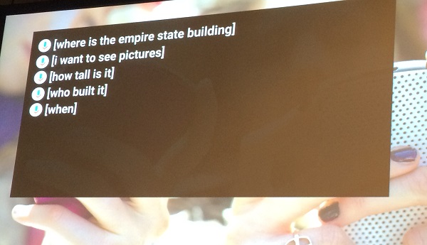
- Voice search: This is the future where you talk to gadgets and they answer you. Search strings like this will work:
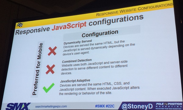
Stoney deGeyter: Configuring Your Mobile-Friendly Site
Common mistakes:
- Blocking JavaScript, CSS and images. Search engines need this to see how your site renders on different screens.
- Unplayable content. There are issues with mobiles playing Flash videos. Use video-embedding that’s playable on all devices. Optional: provide a transcript of the video available.
- Mobile-only 404s. Allow visitors on mobile devices to pass through to your mobile URLs without error.
- Redirecting to the wrong pages. Redirect each URL to the appropriate mobile counterpart – NOT the home page. Make sure redirects work on all devices.
- Use banners instead. Let people get to the content without forcing them to view an overlay.
- Irrelevant cross-links. For example, when you provide a link to view the mobile site from the desktop site or vice versa, make sure you go to the same page and not the home page.
- Slow loading pages.
- Non-responsive images. Use the HTML picture element to serve different size images to different devices based on their screen size. Cheat: use automated “adaptive images” tools and plugins.
- Small touch size. Design for fat fingers.
- Unreadable text. Use EM or REM units on your fonts, and then adjust the base font size for different screen resolutions using media queries.
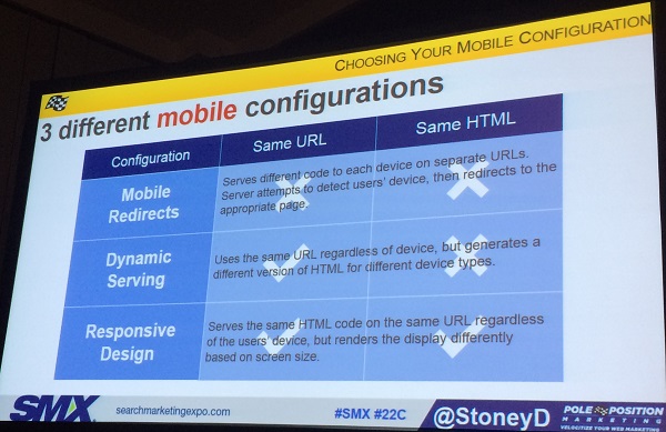
Responsive website configurations:
Marcus Tober: The Data of Going Mobile-Friendly
Marcus’s presentations are slide-heavy and available here: Slideshare.net/searchmetrics
Google is focusing on mobile, so forget about desktop. We use our phones everywhere. That’s why Google focuses on how users interact with content and how to serve it. On mobile we want things as fast as possible.

Concepts like keyword density and how many links on a page is irrelevant in the mobile world. It’s about how we use it, how we share it. Focusing on the content makes us much more successful.
Mobilegeddon was an update Google announced many weeks in advance. There’s always winners and losers of changes.
Losers:
- Boxofficemojo
- Didct.cc
- Reddit.com
In the case of Reddit they implemented a separate m.dot mobile site and recovered all their traffic and rankings.
Mobile Ranking Factors Study
Be aware of the correlation and causation paradigm. Don’t believe that high correlation is a high factor and vice versa. These factors compare mobile and desktop.
They measured the correlation of these factors.
- Presence of unordered lists
- Number of interactive elements
- Number of backlinks
- HTTPS
- Number of internal links
- File size
- Site speed
- Keyword in title
- Word count
- Keywords in body
- Proof terms
- Relevant terms
- Redirects
For the results of the correlation study, view the results here.
Semantic content optimization is about consumer intent and not keywords. Don’t optimize a site with “seattle attractions” but rather “pikes place market” and “space needle”.
No comments:
Post a Comment