The All-In-One Mobile SEO & Design Checklist was originally published on BruceClay.com, home of expert search engine optimization tips.
The mobile user experience really matters to Google. Proof:
- Since 2015, more searches are performed on mobile than desktop, meaning mobile is the main device used worldwide for the majority of online browsing time.
- In April 2015, Google made a pre-announced update to the algorithm that ranks mobile search results. A website’s mobile friendliness officially was dubbed a confirmed ranking signal for mobile search rankings.
- In late 2015, the Google Quality Rating Guidelines were updated with screenshots from the perspective of mobile devices.
- In November 2016, Google pre-announced an update to its search index, moving to a mobile-first index. This means that Google uses your site’s mobile version in ranking calculations.
- And this coming January 2017, sites that show an intrusive interstitial in the transition from a mobile search result to the content clicked will not rank as highly in Google results.
Google is optimizing its users mobile search experience, and webmasters must be in lock step.
Consider this checklist your mobile SEO go-to resource.

If you’re already on board and optimizing for mobile, jump to the section that best suits your needs. If you’re new to the game, start from the beginning and use this checklist as a start-to-finish guide.
Table of Contents
- Choose a Mobile Platform
- Optimize Mobile Sites for Crawling and Indexing
- Optimize for Page Load Speed
- Optimize Design for the Mobile UX
- Implement Analytics to Track Mobile Conversion Goals
- Optimize Your Content for the Mobile Experience
- Test Often and Optimize User Experience
1. Choose a Mobile Platform
There are primarily four varieties of mobile page strategies: responsive design, dynamic serving, separate mobile page and Accelerated Mobile Pages (AMP).
For both mobile and desktop searchers, Google is looking to rank web pages that show high relevance, trust and great user experience.
Remember, to rank for a target query Google needs to deem your web page the most relevant and “least imperfect” option for that query.
While your desktop-optimized web pages may be incredibly relevant, if your code does not allow for your content to fit the smartphone experience, Google recognizes this as a poor user experience. A poor user experience means your website gets further from “least imperfect” and your rank drops further down the SERP.
Since ranking high in mobile search results needs to be a priority, building a dynamic or separate mobile platform for your content needs to be a priority as well.
You have options for how to display your content for the mobile user agent and visitor: responsive design; dynamic serving; a separate mobile site; and Accelerated Mobile Pages (AMP).
The solution – or combination of solutions – that’s right for you will depend on many factors including development resources, conversion goals, mobile keyword research versus desktop keyword research, and persona behavior.
To figure out which mobile optimization strategy is best for you, we recommend reading:
- A Cheat Sheet for Mobile Design: Responsive Design, Dynamic Serving and Mobile Sites – an article that compares and contrasts three technical options for a mobile website.
- Building Smartphone-Optimized Websites portion of the Google Developers website.
- Chapters one and two of Building Your Mobile-Friendly Site: The Distilled Best Practice Guide.
- AMPProject.org for a technical introduction, tutorials and sample code for building an AMP HTML page.
2. Optimize for Crawling and Indexing
When optimizing your mobile platform, don’t forget about your technical SEO best practices.
If you skip the technical SEO on your mobile site, search spiders may have a hard time discerning mobile-specific content from desktop-specific content, which can create a bad user experience in both the mobile and the desktop experience.
Remember the basics: search engine spiders need to be able to discover, crawl and index your web pages in order for them to rank.
In other words, if a search spider cannot find and access your site pages, your site cannot rank.
To help search bots crawl, index and differentiate (if they are different) your mobile site pages, make sure you:
- Create a mobile XML sitemap with a <mobile:mobile/> declaration after each URL listing.
- Submit your mobile site and your mobile XML sitemap to Google Search Console.
- Never design your mobile site using pop-up windows or lightboxes that cannot be discovered through a sitemap crawl.
- Make sure to implement rel=canonical, rel=alternate media and Vary: User-Agent HTTP Header tags as needed to tell Google when it should deliver a desktop version of your web page and when it should deliver a mobile version.
- Make sure to allow the Googlebot and Google Smartphone user agents to access your site.
3. Optimize for Page Load Speed
This is very important to both the user and the search spider!
According to the PageSpeed Insights portion of the Google Developers help site, Google prefers above-the-fold content to render in under a second on a mobile network.
Anything longer than a second, they say, can result in a poor user experience. The idea is to get users interacting with the page as soon as possible.
On the user experience end: According to Google and Strangeloop, 85% of mobile users expect sites to load at least as fast as desktop sites. So improving mobile site speed needs to be a goal.
To help get your mobile sites loading faster make sure you:
- Focus on mobile image optimization to reduce load times.
- Follow the page speed optimization recommendations outlined in the Mobile Analysis portion of the Google Developers PageSpeed Insights resource.
- Use front-end optimization strategies, such as mobile-optimized caching, to address mobile performance issues and get mobile pages loading faster.
- Regularly check your page speed using the Google PageSpeed Insights analyzer.
4. Optimize Design for the Mobile UX
In the context of mobile optimization, design describes the elements of the web page the end-user sees, and user experience (or UX) describes the experience that design creates for the user, how they interact with elements on the page, how the elements on the page make them feel, whether the site is easy to use or frustrating, etc.
Google wants happy, satisfied searchers, so user experience is a huge priority for the search engine. Create a bad above-the-fold user experience and expect your site to rank somewhere far from Page 1.
To really send home the importance of why mobile UX matters, consider this comment by a Google representative:
“According to our studies, 61% of users are unlikely to return to a mobile site that they had trouble accessing from their phone. That includes sites that use fonts which are illegible on mobile, or sites where users have to zoom in or pan around excessively.”
Straight from Google. More than half of your inbound traffic is unlikely to return to your mobile site if they are met with a poor user experience. This means serious loss in conversion, as well as loss of mobile rank.
To get your web pages designed and optimized for UX, we recommend starting with these considerations:
Read Google’s 25 Principles of Mobile Site Design to learn what Google considers “mobile site design best practices.”
Consider how your buttons look, feel and function:
- Are you using Click-to-Call buttons?
- Is your logo a button that makes it easy to get back to your home page?
- Are your buttons finger friendly?
- Have you placed your most important CTA button above the mobile fold?
Consider the UX of your mobile site search:
- Is the site search visible above the fold in your mobile design?
- Can you add filter elements to make searching your site on a mobile device easier?
- Did you make sure it’s impossible for search filters to return zero results?
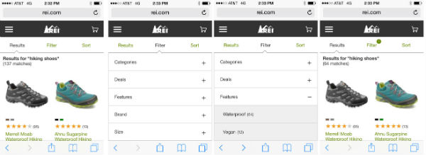
The REI mobile site makes it easy to filter search results.
Is your mobile experience optimized for task completion?
- Can your forms be simplified?
- Can login requirements be simplified? Can users purchase as a guest?
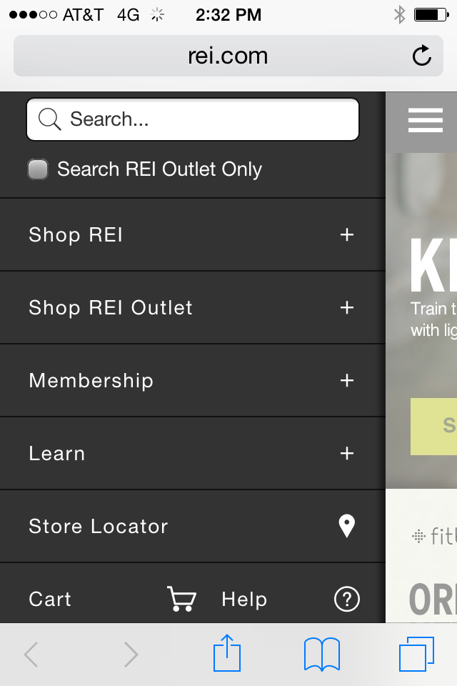
- Are your menus working for the user? Can you simplify them? Would your pulldown menu work better as toggle menu?
- Would a third-party payment service make paying with a mobile device easier for your end user?
- Do any of your forms or other windows open in a pop-up window or lightbox? If yes, fix this. Pop-up windows and lightboxes are bad for UX and SEO.
- Does your user have to pinch, scroll side to side or zoom out to see your web pages? If yes, fix this. The Google representative quoted above specifically referenced a user having to “zoom in or pan around excessively” as an example of bad user experience. Your mobile platform should deliver web content that is sized to fit mobile devices.
An example of a mobile toggle menu.
5. Implement Analytics to Track Mobile Conversion Goals
It’s not a new concept. How can you understand where your web pages are succeeding and failing if you’re not tracking activity with analytics?
Don’t overlook this important step on your mobile platform to show ROI in exchange for buy-in and budget.
Make sure to:
- Implement analytics across your mobile site.
- Develop intelligent mobile- and conversion-centric metrics that give insight into how your personas are interacting with your web pages. Remember to look at micro-conversions and device-specific bounce rate.
- When possible, define your mobile goals early then build mobile web pages with a task flow that makes conversion easier for the user.
- Remember desktop rank and mobile rank can differ greatly. Page one in mobile SERPs tends to include significantly fewer organic results than desktop SERPs, and the keywords your personas are using to search for you in the desktop experience are not necessarily the words they’re using in mobile. Make sure your mobile stats are coming from true analysis of mobile SERP activity.
- Make reporting easier by setting up a custom mobile campaign dashboard.
- Monitor mobile site speed in Google Analytics by navigating to Content > Site Speed.
6. Optimize Your Content for the Mobile Experience
I won’t say “content is king” one more time, but I will say content really matters. Content is the means by which your users get to know you, your products and your services. Thoughtful content is truly key to conversion. Plus, without strategic content you can’t optimize your web pages for keywords, which means your web pages can’t rank in the desktop or mobile experience.
When approaching content creation with an eye toward mobile optimization think:
- Is your content resonating with mobile users? Don’t set it and forget it. Instead, keep on adding and testing content types and measuring the corresponding mobile tracking variables.
- All mobile content is not created equally. What works and reads well on one device type might not work at all on another (think smartphone experience versus tablet experience).
- Is your content easily read without excessive scrolling or zooming? Are your digital assets – images, videos, navigation, etc. – easy to see without scrolling or zooming?
- Are you calls to action front and center? Can you place a call to action above the fold?
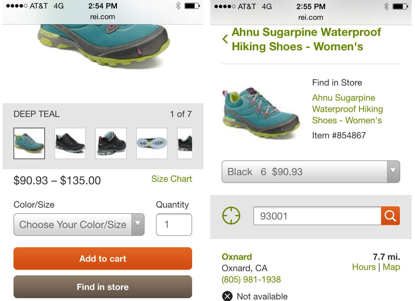
Here, the REI mobile site uses a “Find in store” button to optimize for local UX.
- Can your content be optimized for local? For instance, can you include the stock of product available nearby like REI does?
- 62% of keywords have different ranks between desktop and mobile. Have you done mobile-specific keyword research? Are your mobile users using search phrases that are very different from the phrases your desktop searchers are using? If yes, consider using dynamic serving to deliver mobile-optimized content to your mobile users.
- Are your meta tags optimized? When appropriate or necessary, are they optimized specifically for mobile?
- Social content is mobile content. Are you integrating your search, social, video and mobile campaigns?
7. Test Often and Optimize User Experience
So you picked a mobile platform, designed your mobile pages with user experience in mind, and created mobile-optimized content. Great! Now… is it working?
Does it look like you intended it to look? Is Google seeing it how you think Google should be seeing it? Are all the usability features you built into your web pages actually working for your users?
Don’t set it and forget it. Mobile optimization is all about testing and retesting over and over again.
While testing is the final step in our checklist, remember that testing isn’t like putting a fork in it and calling it done. As an optimizer your work is never done, instead you should consider it “done for now until it’s time to test again.”
When testing and retesting your mobile web efforts, make sure to consider these factors:
- Have you tested on a range of devices using an emulator, or a series of actual devices?
- With each website release, the configuration needs to be checked.
- Are you testing your UX using real people that represent your personas? Have your friends and family test your site.
- Have you recently run your mobile-optimized website through the Google PageSpeed Insights tool to glean insights about user experience and site speed? (Don’t miss the User Experience section of the SiteSpeed Insights tool!)
- Google will add snippets to mobile SERPs warning searchers when the website they see listed may yield a sub-optimal user experience. Warnings include “Uses Flash” and “May not work on your device.” Have you checked to see whether your site is being amended with Google warnings in mobile SERPs?
- Use the W3C Mobile Checker to test your website’s true mobile-friendliness.
Anything Worth Doing Is Worth Doing Right
Hunter S. Thompson wasn’t thinking of mobile website optimization when he said “anything worth doing is worth doing right.”
Yet there’s no better quote to emphasize not only the importance of mobile SEO, but more so the importance of effective mobile SEO; of not just optimizing for mobile, but optimizing the right way for mobile.
Times are changing and the way that people use and access the internet is changing, so we as marketers need to be changing the way we think, analyze, create, package and deliver content.
How are you optimizing your web pages to make sure they are mobile ready?
For more information on how to optimize your pages for speed and mobile SEO, we recommend these resource:
- Webmaster’s Mobile Guide by Google Developers
- AMPProject.org
- SEO Tutorial: Mobile SEO and UX Optimization

Let us help you drive and track traffic to your website with a mobile-first SEO strategy. BCI’s services are tailor-made to match your business goals and audience. Let’s talk more about growing revenue through digital marketing.
This post was originally published by Chelsea Adams on Oct. 29, 2014, and updated on Nov. 23, 2016.
No comments:
Post a Comment