7 Mobile-Friendly Navigation Best Practices was originally published on BruceClay.com, home of expert search engine optimization tips.
It’s now 2018, and we are officially living in a mobile-first world. In fact, Google has begun the switch to a mobile-first index — which means Google will rank your website based on your mobile content, relevance and UX.
Your mobile navigation (menus and internal links) contribute to all three.
Good mobile navigation makes it easy for people to find what they need, without bogging down page speed or cluttering the screen. It also needs to keep PageRank flowing to the important pages that you want to rank well in search.
Site navigations historically included everything on a site in huge, multi-tiered lists. On mobile, that approach doesn’t work. It looks cluttered. It requires scrolling. And it causes your visitors to bounce away.
Here I’ll lay out seven mobile-friendly navigation best practices that make life easier for people visiting your business site on a mobile device:
- Keep mobile navigation short and sweet.
- List the most important pages first.
- Think of search as part of your navigation.
- Make your navigation intuitive.
- Be thoughtful about fonts and contrast.
- Design for touch.
- Design for the multi-screen mobile user.
Note: All of the mobile navigation tips mentioned in this article are equally applicable to separate mobile sites, responsive design sites, and sites that dynamically serve web pages. If you’re not sure what that means, or which mobile platform is best for you, read our Cheat Sheet for Mobile Design.
7 Mobile Navigation Best Practices for UX & SEO
1. Keep Mobile Navigation Short and Sweet
Many mobile phone screens are only 720 pixels wide in portrait mode.
Designing mobile navigation means designing for a small screen size. With limited real estate available, there’s no room for clutter. Get right to the point then cut the fat.
Ask yourself, what links need to be included to help your user complete priority tasks? What elements from the desktop navigation aren’t relevant in the mobile environment?
To save your user from decision paralysis, we recommend you limit your mobile navigation to four to eight items on the top level. Your mobile navigation menu is not the place to link to every page in your site.
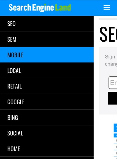
To keep it short and sweet, you may even consider adding a top-of-page logo that navigates to the homepage and leaving the Home button out of your navigation all together (as on the BCI website, below).

Comparison of BCI’s desktop and mobile navigation
Some mobile navigations require multi-level navigation to aid user experience. This is more common with ecommerce websites. If you must go there, keep it as simple as possible. Don’t add more than one sublevel of dropdown functionality.
If your navigation must include more items, a vertically oriented navigation activated from a menu icon is the best option.
If your mobile user’s typical needs are very limited, consider using a static navigation that runs across the top of your design, like we see on the GameStop mobile site:

GameStop uses static navigation across the top of its mobile-friendly view.
A navigation that requires horizontal scrolling probably won’t be mobile-friendly. Some sites have the resources to design a sleek image-based carousel type of interface, such as what Google uses for certain search results. That might be an exception, but consider your audience.
2. List the Most Important Pages First
Your website users don’t have a lot of time — or patience. How can you help them get to the right place faster?
To design your mobile site navigation, first think about:
- What are your most important pages?
- What are the top category pages outlined in your siloing strategy?
- What are the most common actions taken by site visitors using smartphones?
- What pages of your website most effectively satisfy a mobile user’s needs?
The answers to these questions influence not just which items go in your main menu, but also which links and calls to action you should put on each page.
You’ll want to keep your main navigation menu consistent throughout the site. It should point to the top four to eight landing pages (such as main category pages).
A short-and-sweet mobile nav is a win-win for SEO and your users. It preserves the flow of link equity to your most important pages while also helping users get around.
Once users arrive on a page, contextual links can move them to wherever makes sense. These links can be added within the body content of each page in a comfortable way.
For instance, a long blog post may have multiple sections and thousands of words. Have mercy on your mobile users — don’t make them scroll to find what may be pertinent to them. Some ideas:
- Show a TL;DR summary at the top of a long article. If readers want more detail, they’ll scroll down.
- Give anchor links at the top that jump a reader to the different sections below (as I did at the top of this article).
- Include useful calls to action and links to related pages within the body copy where they make sense.
The mobile navigation model I’m describing — a short, consistent main menu coupled with contextual links that vary per page — actually supports siloing better than the massive structured menus of old. A parent only links to its children, maintaining a clear hierarchy and intuitive flow. Internal links allow PageRank to flow to topically related pages naturally.
When it comes to mobile users, quicker is always better! It will take some work for you to make each page deliver the most appropriate navigation options. But you’ll improve user experience and no doubt your ROI by giving visitors a more direct path to what they need.
While we’re on the topic of “quicker,” remember that fast mobile pages make for a better user experience. Google announced that page load speed can factor into your Google search rankings, so a streamlined navigation helps with mobile SEO.
You can test your mobile page speed with Google’s mobile speed test (or use our SEOToolSet ).
).
3. Think of Search as Part of Your Navigation
Mobile users look at search as navigation, and you should too.
Consider Amazon.com. On mobile, Amazon doesn’t even bother with the category dropdown (although it’s there under “Departments” if someone wants it). What’s prominent at the top of the mobile view is a simple “Search” box.
Even with its massive catalog, Amazon doesn’t expect users to navigate through menus to find what they need. Most of the time, customers just type in a product name and go directly to buy it.
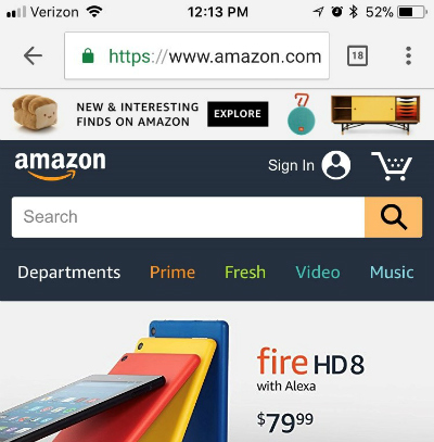
The Search box is Amazon’s most mobile-friendly navigation option.
On mobile, your search box is often the most direct route to what a user needs.
Set it up and make sure it works well!
4. Make your Navigation Intuitive
Your customers work hard enough; navigating your site should not be work.
To make your navigation intuitive, menu language should always be written in a way that lets the user know what to expect. It should be clear what the item does if it’s a dropdown, and exactly where it goes if it’s a link.
If you are using symbols to convey information to your users, make sure they are clear, conventional symbols. For instance, if your menu items drop down, use an intuitive symbol like a plus sign (+) or an arrow (>) to let your users know a click will reveal more options.
Another best practice example would be using a magnifying glass to indicate a search feature.
If you are using a toggle menu, use three stacked lines — the icon highlighted in the example below — to help the user locate and access your main nav.

REI’s menu opens from a hamburger icon.
TIP: A hamburger-style menu icon like this often gets more clicks if it also has the word “menu” below it (according to A/B testing. If your design has room, you might test this to see if it makes your mobile site more intuitive and increases clicks/conversions.
The goal is for your mobile navigation to make life easier by limiting thinking, scrolling and clicking.
About Breadcrumbs in SERPs
It’s worth noting that since 2015, Google has displayed URLs in its mobile search results differently than it does in desktop SERPs. The change replaces a web page’s URL with a description of the page’s location in a breadcrumbs-like format. If this doesn’t scream of the importance of siloing and clear hierarchy, nothing does!
Now, rather than showing a page URL, Google’s mobile search results display a breadcrumb path beneath each title.
For example, mobile search results for “history of Google” include a Wikipedia result showing how the URL appeared in the past versus the current breadcrumb style:
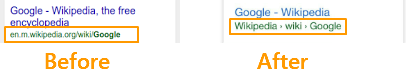
How Google’s mobile search result URLs have changed
TIP: You can control how your breadcrumb URLs appear if you add schema markup to the HTML on your pages. Refer to Schema.org’s breadcrumbs structured data for details and Google’s help file on breadcrumbs. (For more on this update and what it means, see our post Google’s New Mobile Breadcrumb URLs: Making the Most of Your Site Name & URL Structure.)
5. Be Thoughtful about Fonts and Contrast
Your website users shouldn’t have to zoom to read any of the text on your mobile website, including the text within your navigation.
Tiny text that requires zooming creates a bad user experience, and neither your website users nor Google or Bing like poor user experiences.
All of the text on your mobile site needs to be large enough to be read on a variety of devices without zooming. This principle needs to be a top priority that you consider as you build your mobile-friendly CSS (cascading style sheets) to control the appearance of text on various devices.
To make your navigation text easy to read, choose a font that naturally adds enough space to distinguish between letters and is tall enough to be clearly read in a menu.
Your font size and style also depend on your brand’s style guide and what fits your unique demographic. For instance, a young audience may not struggle with smaller or condensed fonts as much as an older demographic would. The way you handle formatting such as bullet styles, capitalization, margins, captioning, and so on should also reflect what’s attractive to your audience and comfortable for them to read.
Once you decide, set up your CSS and create a written style guide to keep your content consistent.
For designing the look of your mobile navigation, best practices can’t give you a one-size-fits-all recommendation. What’s important is that every word on your mobile site can be read easily without zooming. I recommend you perform user testing to see first-hand whether your font is tripping up users.
Also, make sure there’s sufficient contrast between your text and its background. WebAIM guidelines offer rules for color contrast (recommending a minimum ratio of 4.5 to 1). You can try their contrast checker tool to see how your text treatment measures up.
Google gives a few examples of what different contrast ratios look like:
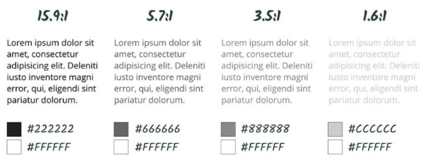
Text needs contrast against the background for readability on a phone. (Per Google)
In addition, Google points out that “classic readability theory suggests that an ideal column should contain 70 to 80 characters per line (about 8 to 10 words in English). Thus, each time the width of a text block grows past about 10 words, consider adding a breakpoint.”
This tip applies to body text; consider a shorter maximum length for your menu options.
Not sure if your text is easy to read? Run your site through Google’s Mobile Friendly Test tool.
6. Design for Touch
Tablet and smartphone users rely on touchscreens to get them around websites. While a pointy mouse arrow allows users to precisely select items in tight spaces, the average finger requires a larger target to press. Many users don’t hit a touchscreen exactly where they are aiming.
Google recommends building mobile pages with a minimum touch target size of 48 pixels with a properly set viewport (more on that later). And touch targets should be spaced about 32 pixels apart, both horizontally and vertically.
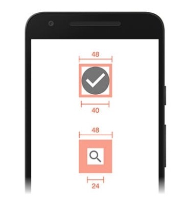
Buttons and touch targets should be big enough to be mobile friendly. (Per Google)
Build navigation buttons with a target smaller than 40 pixels and your user experience plummets. Visitors end up sloppily navigating to the category above or below the one they want.
Don’t frustrate your users!
Since people are so bad at hitting their tap mark much of the time, it can also help to incorporate touch feedback into your navigation. Your feedback could be a color change, a blink of color, a font change or another visual cue.
Even if it’s subtle, this feedback can improve user experience by helping to reassure users that they’ve selected the right item. Take a look at the example below from Search Engine Land:
Color changes show which menu item is touched on SearchEngineLand.com.
If you are using multi-tier navigation, it’s also important that you make sure your dropdowns are activated by touch — not mouse over. Clearly, hover navigations work just fine in the desktop experience, where hovering is a possibility, but they leave mobile users stuck.
Another touch-friendly option is to design a supplementary navigation that uses images and exaggerated graphic buttons. This type of navigation can be a great homepage asset that gets your visitor headed in the right direction quickly.
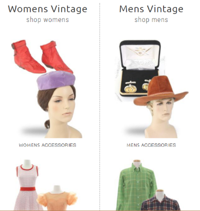
Vintage clothing site RustyZipper.com uses large graphic “button” with text labels for mobile-friendly navigation.
It’s important to note that graphic buttons like these should only be a supplemental option used alongside a toggle navigation or a static top navigation. You need to have a consistent navigation that the user can access at the top of every page.
While you may be able to include this graphic navigation at the bottom of your mobile pages, it’s not optimal or practical to use these big graphic buttons as your primary navigation. And always consider the load-time performance impact of images and buttons.
Be Careful with Popups
You also want to avoid intrusive interstitials — those popups that monopolize the screen when a visitor clicks through from a search result. In January 2017, Google rolled out an intrusive interstitial penalty for mobile search.
Per Google, “Since screen real-estate on mobile devices is limited, any interstitial negatively impacts the user’s experience.”
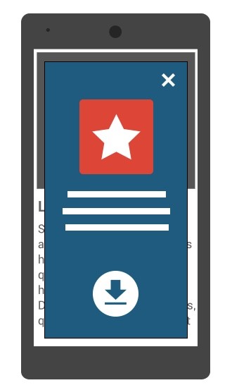
Example of an intrusive interstitial popup (credit: Google)
Be careful to use interactive forms and popups courteously. Some best practices for these include:
- Apply a delay or time interval between views so you don’t annoy your visitors.
- Reduce the amount of screen space your element covers.
- Try a bar or box that scrolls in from the bottom or side.
- Avoid covering the middle of the mobile screen or obstructing your navigation elements at the top.
- Let no be no. If a user closes a form, don’t display it again within a reasonable period of time (perhaps a week later).
7. Design for the Multi-Screen Mobile User
Chances are good that interested website visitors come to your website using multiple devices over a short period of time.
To help them feel confident they’re in the right place, it’s smart to give your mobile and desktop sites a consistent visual theme.
Your mobile and desktop navigation, however, do not have to be — and sometimes should not be — identical twins.
While the colors, fonts and themes you use for your mobile and desktop navigation need to be consistent to reinforce your branding, the similarity may end there.
Your mobile navigation needs to help users navigate around your website and accomplish tasks. Consider the content your smartphone users need and the tasks they are looking to accomplish, and then build your mobile navigation specifically for a smartphone user.
- What mobile-specific calls to action need to be built into your navigation to aid user experience?
- Does it make sense to include a “Call” button or a store locator?
- Can a mobile user easily find essential information like your address, directions, phone number, hours of operation, or other facts?
Remember: Space is limited, mobile needs are unique, and on-the-go patience is minimal.
Because website visitors will use a variety of devices and screen sizes, specify a viewport using the viewport meta tag.
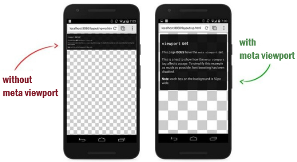
Websites need a scalable meta viewport for correct display on smartphones.
Common mobile mistakes include having a fixed-width viewport that doesn’t scale for all devices, or assuming too wide of a viewport, which forces users on small screens to scroll horizontally.
Mobile-Friendly is Customer-Friendly
Creating a mobile-friendly navigation means creating a customer-friendly navigation that gets your personas moving in the right direction right away.
If you build an intuitive navigation that is easy to use, your website users will be headed toward conversion happiness in no time. Build a navigation that is frustrating or confusing, and they’ll be headed back to the search results and straight toward someone else’s website.
To keep your inbound visitors smiling, follow these best practices to make your mobile-friendly navigation:
 Short and sweet whenever possible
Easy to read
Task-oriented
Prioritized with what’s most important listed first
Accessible and placed consistently across all pages
Clear, straightforward and expected
Vertical if scrolling is required (never use horizontal scrolling!)
Easy on the eyes
Finger-friendly
Fast
Be a leader — share this post with friends or colleagues who are as interested in UX as you are. For more resources like this one, subscribe to our blog.
Editor’s note: This article is based on an earlier post written by Chelsea Adams for the Bruce Clay Blog.
No comments:
Post a Comment